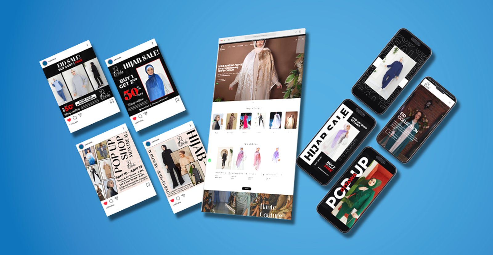
Shopping cart
Your cart empty!
Your cart empty!
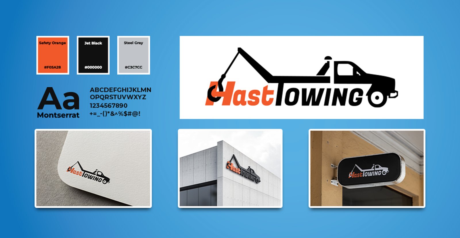
To create a bold and memorable visual identity for Hast Towing, reflecting the reliability, urgency, and professionalism of its services. The goal was to build a brand image that stands out on the road and reinforces trust at every customer touchpoint—from signage to digital presence.
Brand Development: Crafted a strong, industry-appropriate logo featuring a stylized tow truck to clearly represent the service.
Color Psychology: Incorporated Safety Orange (#F05A28) for urgency and visibility, Jet Black (#000000) for strength, and Steel Gray (#C3C7CC) for neutrality and balance.
Typography: Used the Montserrat typeface to communicate modernity and professionalism, ensuring clarity across print and digital applications.
Signage & Presentation: Applied the logo across real-world applications including storefront signs, business cards, and promotional materials to maintain visual consistency.
Scalability: Ensured that the design system works at all sizes—from street signage to social media avatars—without losing impact.
The new brand identity has given Hast Towing a professional and consistent presence that helps build recognition in a highly competitive local market. The bold color palette and clean typography have been successfully implemented across all platforms, reinforcing trust and making the business instantly recognizable both online and on the road.


Just like you, we want to build products that make us proud.